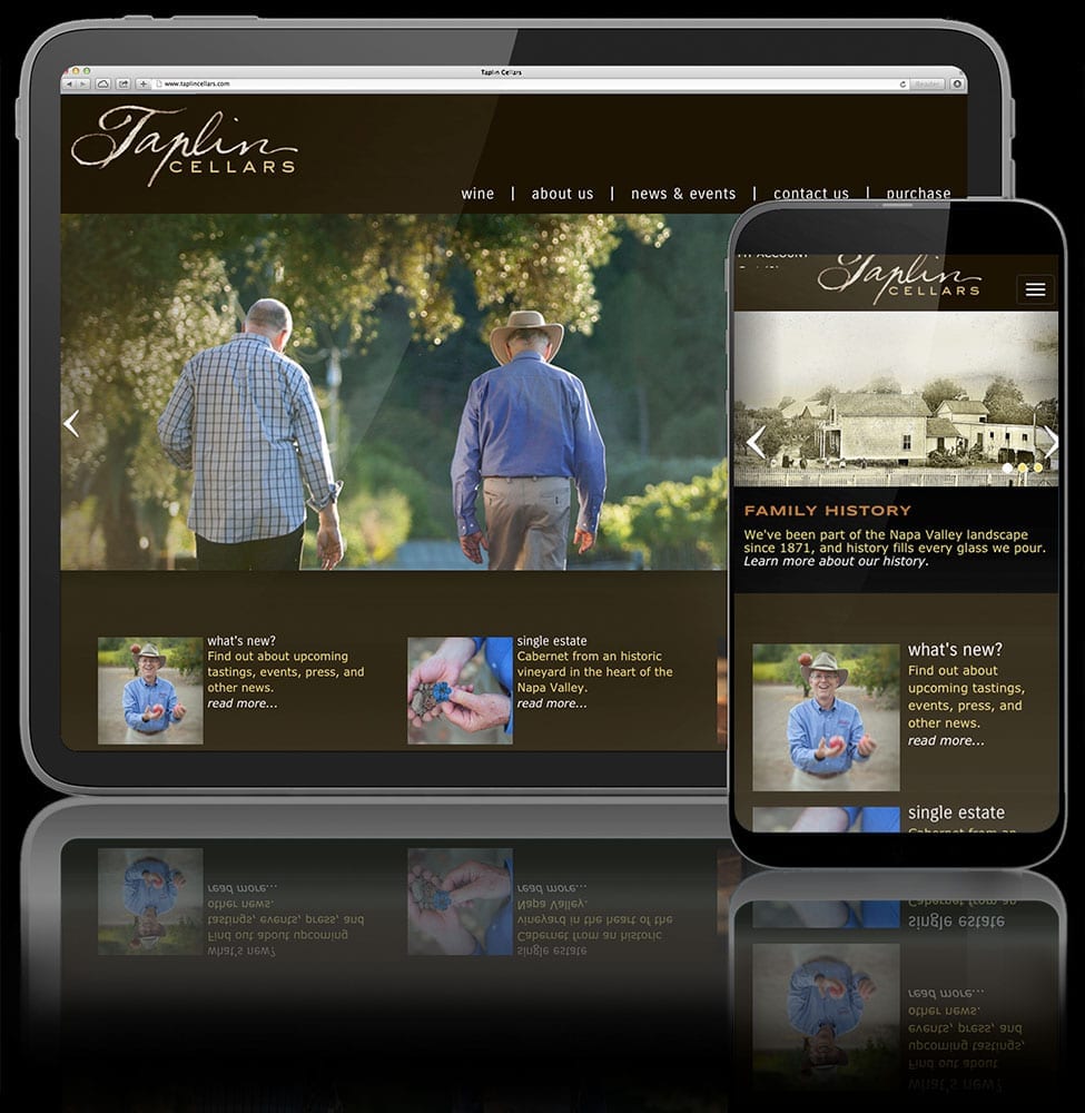
Helping build winery websites is a huge part of what we do. It never gets old. It’s always a challenge. Why? Because anybody can sell anything online these days, but as soon as you try peddling alcohol, things get pretty interesting from a regulatory standpoint.
The other challenge is the not-so-simple matter of content: that word that gets bandied about quite loosely in our digital world and can mean so many things. So many “I hadn’t thought of that” things, as is often revealed when new clients fill out our initial questionnaire. For the sake of this post, let’s just define content as images-and-words. They play a massive role in defining the very structure of any modern website. Which is just a big empty bucket waiting to be filled with those images and words.
It got me thinking about what’s most important when getting any wine-centric website off the ground. So, let’s turn winery website design inside-out for a minute, and look at the “Balzac way” of starting your website design project on the right foot…
Photographic Content Drives User Experience
With an explosive increase in available bandwidth, winery websites have become visually expansive. Expectations are cinematic—visitors expect an immersive experience. And this is a good thing: making a visitor feel like they’re part of an inner circle, part of an exclusive club, is wine marketing 101.
Photography is the “hook”. Getting back to that big, empty bucket: the first thing any site visitor will see is likely to be an enormous image of your location or product—inhabiting at least 75% of their initial screen view—with a rather modest amount of copy reinforcing brand message and calls-to-action. Every aspect of site design, from the assumed logo-and-navigation masthead that people’s eyes dart to first; to the layout of in-depth winemaking pages; right on through to that purchasing experience that you (literally) bank on visitors sticking around for; it’s all essentially woven around and through photographic content.
You have but a single opportunity to establish a connection with your visitor, and their short attention span theater: draw them in or lose ’em forever.
User Experience Dictates Visual Design
As Balzac’s Creative Director, I always find myself in the humbling position of allowing content and user experience to drive site design, while graphic design in the classic sense (curlicues, fonts, color palette, border treatments) has become inexorably linked to UX: form follows function.
Those style elements from your brand book? They absolutely matter. But the graphically-heavy “magazine-style” site treatments often seen in the first 15 years of web design are over, and this is also a good thing. Good design has always been about communication through effective composition. It’s just that now, that effectiveness is gauged by how effectively a visitor can parse your content to the point where they can get it, get what they need, and get out. How motivated they are to become a part of that aforementioned inner circle and maybe just buy some of your wine. And this is still great graphic design: it’s just less about those curlicues and more about guiding the visitor’s journey. Spoiler: it always was.
You Are Not A Tube
But it’s very okay to be social and conversational with your content.
We’ve seen too many winery websites that attempt to leverage clever navigation, next-level motion graphics, interactive activities, and novel-length personal biographies to position their websites as a place for visitors to hang out and goof around for a while. Remember what I just said about getting in and getting out? Let’s face it: they’d rather watch zany cat videos. If they’ve already taken the time to cruise over to your winery website, consider yourself one lucky business owner, and honor that gift. They’re here to find out about your wines.
However, structuring your winery website to serve up casual, conversational posting as a central element is an awesome way to capture social media users and ultimately drive them to your website. Where they might actually give you more than a thumbs-up ($). Keeping your site posts Instagram-short while using the various available digital tools to actually sync your posts with social platforms, positions you to capture new audiences and hold existing visitors without any duplication of effort.
Speaking of Navigating Content…
Studies that track eye motion in website visitors have clearly shown that people, after all these years of site navigation, have developed common behavioral cues. In the vast majority of monitored activity, visitors’ eyes dart first to the upper left, then the upper, right, and finally upper middle. All this before they ever settle on all that cool stuff you put dead-center. Give the people what they want: top-of-site horizontal navigation, with your vital brand message on the extreme left, and your purchasing options on the extreme right. Everything else goes in the middle. If you populate those first two zones properly, visitors might just stick around.
Of course, with mobile navigation, the standard has already become the ubiquitous “burger”—those three fat horizontal lines in the upper or lower right that everyone knows the menu is hiding behind. It’s already becoming quite clear that the next trend in both site design and visitor behavior is to go find a juicy burger even on a desktop or laptop. It makes total sense from a space-saving POV and allows that engaging top-of-site content to grab the viewer even more quickly. As you structure your winery website, make sure you leave the door open for a fully burger-based nav in the future, or just do it now.


